

Never miss an idea again.
Ambit is a mobile app that is dedicated to solving the challenge that content creators and creatives face capturing their next big idea on the go, anytime, anywhere.

THE CHALLENGE
Being someone that always comes up with their best ideas while out and about and nowhere near their laptop or notebook, I was constantly throwing my ideas into my notes app on my phone, ultimately getting lost or forgotten.
THE GOAL
To design an app for recording ideas on the go and keeping them organized with ease.
ROLE
UX Designer
UI Designer
Motion Designer
CLIENT
Vancouver Film School (Student graduate project)
DATE
August 2021 – November 2021
I created a case study video for Ambit to summarize my project, and bring the viewer along the journey of concept to completion.
01
Research
My research began with a series of user interview questions, from a group of individuals that represented my target audience. As I progressed through the interview sessions, I noticed a trend in information I was receiving from the questions I asked, questions like “When you come up with a great idea, where does it usually happen?”. Once I had pooled all of the data I had incurred, I began mapping out connections through an affinity diagram.
Through my affinity diagram, I was able to find key insights that further helped me understand the needs of my archetype better. These summaries then turned into my top insights I gathered from my diagram. These top insights included:
“I often forget my ideas if I don’t write them down, or just hope to remember.”
"If I don’t write my idea down right away, it will get watered down."
"I need to stay on top of my organization if I want to pursue and execute my ideas efficiently and effectively."
With the gathered information from my top insights, I went back into my user interview data entry points, and concluded that:
80%
of my interviewees had their best ideas walking, driving, or in the shower.
80%
forgot about their ideas if not recorded immediately.
70%
would not follow through with their idea if not organized.
Empathy Map
Creating an empathy map further supported how my archetype would feel while thinking about the challenge the face with creativity and content creation within their daily lives. Breaking these thoughts into categories really helped me proceed how to go about the other supporting documents I created to understand my audience better.
Customer Journey Map
Along with the experience map, I also created a customer journey map to explore the stages a user would go through when discovering Ambit. Firstly, they consider the app because they understand that with great power comes great responsibility, meaning the more brands that contact them, the more work they'll get and the more ideas they'll be needing. Leo wanted to explore a better solution to what he was using previously, which was the notes app on his phone. He started looking for apps that could help him organize better. Leo starts to compare what is out there to what he found. He starts asking around for any other resources to help him make a decision. He then starts testing the app out wherever he goes, and realized that with the features it possesses, it truly helps him on a day to day basis.
Experience Map
I broke it down into 4 stages of how a user may feel during the process of finding this app. During the awareness stage, the user may feel excited and solution driven to figure out their pain points, yet overwhelmed with all of the resources out there. When they start to consider the app as an option, they may feel optimistic because of the opportunity to find something that may solve their problems, yet uncomfortable, since learning anything new creates obstacles. The onboarding stage may leave them feeling frustrated from the learning curve of learning something new, yet determined to get it working the way they need it to. During the advocacy stage, they feel comfortable using the app, and trust it to get the job done they need it to, perhaps even telling their colleagues and fellow industry friends about it.
Mental Model
These stages look similar to the customer journey map and conclude my data found within the research I had conducted thus far. The questions that came up for the mental model stemmed from pain points found within my user interviews, such as 'will I be able to afford time to learn a new app?', and 'will this replace my notebook?', 'will this help me execute my ideas better?'.
I moved on to creating a SWOT analysis on the top 10 note taking apps for IOS. Once the analysis was complete, I created an evaluation summary from my findings that would further support what I could do with Ambit.
> Short cut mode to add notes immediately
> Avoid too many distractions and colours. (keep it simple)
> Customization of your space, including background colours (plus light/dark mode)
> Layout must be simple yet intuitive
-
is the average size of a woman’s hand.
-
is the average size of a man’s hand.
To truly optimize the experience of recording notes while on the go, I thought how someone would handle their phone while on the move. From my own testing, I have the size of an average woman's hand, and I cannot reach anything above the 3rd line of icons on my phones home screen using one hand. Since I'm usually only using one hand with my phone when i'm on the go, I made the decision to put all important interactive buttons below the dotted line, for optimal use.
02
Wireframes
Within my initial wireframe building phase, I have cultivated different user journeys in which the screens would typically be accessed and used. Using Figma, I began to rapid prototype how my wireframes were going to look and how the experience was going to benefit my user in the most optimal way possible.
I thought about the creative person that is extremely busy and gets disorganized quickly, the content creator that likes to add images to their notes to visualize their concept better, and the one who likes to have everything customized, down to their home screen background colours.

03
Visual Identity
I kept the overall visual identity of my project very simple. I chose to use Roboto as the main typeface throughout the app, and used Urbanist for the logo. I also chose to design very minimalistic iconography for Ambit to speak to the minimalist interface the app had.
Typography

Icons
I wanted the logo to embody the essence of quick note taking. The lines coming from the ‘a’ are to represent speed, as this app celebrates quick note taking, but also resembles lined paper, making it the perfect symbolic addition to the word mark. The colour blue can spark and represent freedom, intuition, imagination, expansiveness and inspiration, which is exactly how we want our users to feel when using Ambit.

Using Adobe After Effects, I added a bit of motion to Ambits logo, to bring it further to life.
04
Prototyping
After a series of reviews with my project mentor and instructors at VFS, I decided to focus on three major solutions I discovered during the research phase when prototyping my design. I also realized that with this type of project, the simpler, the better, which caused me to simplify the user journey’s I had created previously.
Three major solutions:
-

Hands free note taking, for creatives on the go.
-

Auto Organization, so user's don't have to.
-

Never miss an idea again with a nudge notification


I realized that the more complex the system of an app that users need for fast action, the less they're most likely going to use it. With that in mind, I altered a lot of the systems I had originally in place, like having the nudge feature in the settings. when in reality, it would be much more convenient and way less on the users cognitive load to have it accessible right into the note page itself.


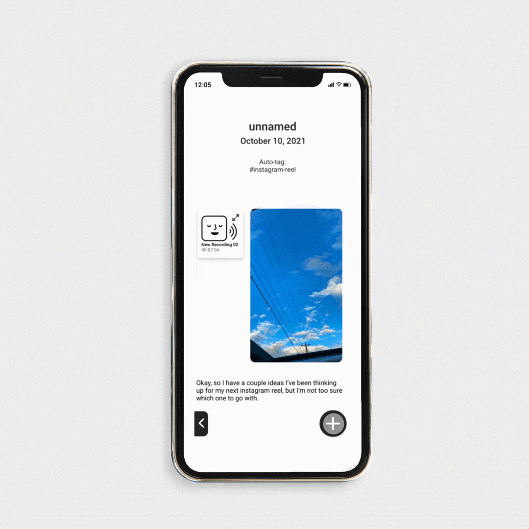
Making the switch to a full screen interactive experience with the users previously created notes was a more ideal experience for my demographic as well. After user testing, I found that a majority were questioning why a graphic would take up such a large portion of the screen when they logged in, and it was often distracting to what they were trying to achieve.
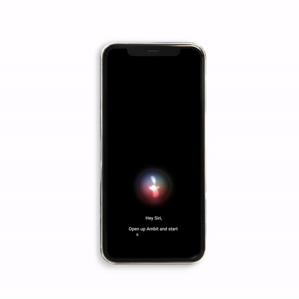

I wanted to take the walkthrough experience of the app prototype as realistic as possible. To ensure that, I focused on making very engaging animations throughout, like my homemade Siri orb and lock screen replica.
View my lock screen walkthrough prototype video here.
View my features walkthrough prototype video here.


I also created a version for the apple watch as well, to better serve the idea that this app is available for creatives and content creators on the go. It is a simpler version, but it fully interactive with the mobile version. The user can still record notes and view recently created notes on the mobile app.
View my walkthrough prototype for the Apple watch here.
05
Final Assets

To complete my project, I created a 15 second instagram stories advertisement to target my user demographic directly. Click on the thumbnail to watch.